I've always loved colourful buildings. It's something that goes back to my early childhood.
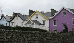
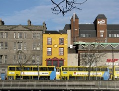
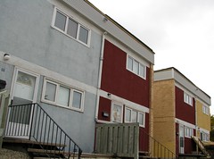
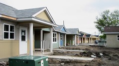
I regularly visited Ireland where it isn't uncommon to see a row of houses that include a red, purple and blue one, or a centuries-old retail street with glaring yellow facade inserted into the mix. I also spent the first few years of my life in the Willow Park Housing Co-op on Burrows Avenue, affectionatley known as 'Lego Land' because of the mixture of colourful facades.
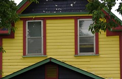
In the past couple of decades it has become increasingly common to see boldly coloured homes here, especially in the West End or Wolseley and now even in new suburban developments that once stuck to neutrals and pastels.
This splash of colour has moved onto the commercial streetscape as well.
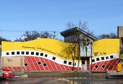
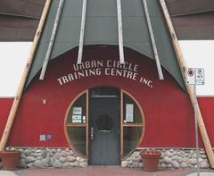
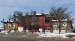
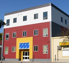
Last decade saw the introduction of the aboriginal medicine wheel inspired palate of red, yellow, black and white. One of the first and most obvious examples is the Norrie Centre on Selkirk Avenue which opened in 2005. Since then, it has almost become a staple for new, Aboriginal-related social service buildings.
Earlier this year, Anybody Want a Peanut wrote of the "Haciendaization" of St. Mary's Road that began with the blood orange Banville and Jones in 2005 and continued with the deep red of Miller's Meat Market and the rich, golden Santa Lucia Pizza.
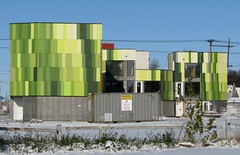
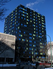
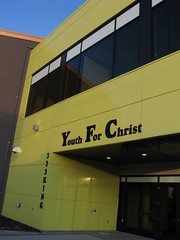
In the past year a new, bold and perhaps risky colour splashed onto the scene: lime green. Some buildings chose to use it sparingly, such as 363 Broadway and Youth for Christ's Youth Centre of Excellence. Others, like the new Centennial Recreation Centre and the BG BX condos at St. Matthews and Wall have taken it to a whole new level.
As someone who appreciates a colourful street scape I have to say that it's quite interesting to look at - for now.
Unlike the other colour schemes that are rooted in some historic, cultural or geographic context, the lime green isn't, (at least as far as I'm aware.) It makes me wonder that if in a few years it will be seen as the the Miami Vice powder blue and pink that still adorns,and dates, the interiors of some of our 1980s developments like Portage Place.
Only time will tell whether building owners will soon be scratching their heads to devise inexpensive ways to de-green their buildings. In the meantime, though, welcome to the streetscape !





7 comments:
I really like the bold green graphics of BGBX. It will be interesting to see how long it lasts before the owners feel the urge to update the look... there seems to be a "design curve" where something current looks dated in about 10 years and horribly out of date in about 25 years before it starts to become retro-chic again. That curve is even more pronounced for really bold designs like BGBX.
The U of W's Centennial Hall is a good example of a building where if they had held on to the interior design a few years longer it would have looked cutting edge again, but they gave in just a little too early.
(And oh yes, Merry Christmas!)
Merry Christmas to you, too, OMC !
Sad thing is when they take something like UW and redo it, it's once bitten - twice shy. They'll redo it in a boring, neutral style not wanting to be design forward and risk having to change it again in 10 years.
Passed BG BX today and stopped to take another look. I do like the green panels, though the rec cenre's a bit too big a building to pull that off !
Curses to you! I have a similar post in the works... mine is more residential though, so I'll let you live ;) Merry Christmas from me as well!
Let's think of them as companion pieces, then ! Merry Christmas !
You beat me to it too, though it wasn't so much the lime green that I was going to point out, but rather the random design coloured panels. The solar chimney on the Hydro building is another example of that & the Asper research centre at St.B hospital.
I'll probably still go ahead and do it at some point. Thanks for pointing out one or two that I wasn't aware of. Hope you had a Merry Christmas!
We can link the three posts together for a Winnipeg design feature !
Post a Comment