


 Beck wasn't a designer or artist but rather an engineering draftsman who sometimes worked for the Underground. It was during a layoff in the early 30's that he decided to take a shot at improving the increasingly cluttered map used by the company. He revolutionized map making by foregoing actual geography in exchange for ease of use and understanding.
 Today, his map is still the basis for not only for London's Underground but for most of the 80 subway systems around the world. Beck's maps have have been shown in modern art exhibitions and was chosen one of Britain's top three design icons of the 20th century, (along with the Spitfire and Concorde), in a 2006 BBC contest.
 I've relied on Harry's work in London and Munich's variation as well. I sometimes think about these maps when I see people confusedly walking around in our 'skywalk'. Despite it being a fairly simple system - a mostly straight line with a ball at one end - we've never really done a great job conveying it's simplicity to newcomers.
Initially, the skywalk relied on each building owner to wayfind people in and out of their own section of the system with mixed results as this 1988 Rocki Rolletti skit shows. In the mid 00's a Pittsburgh design firm was hired to create a unified system. The system was rebranded "The W" Walkway System, (a name that 95% of Winnipegger's wouldn't recognize).
Despite it being a single finger stretching from Portage and Main to Portage and Memorial it was given three colour codes:
 As the wayfinding firm describes:
Wayfinding within the complex walkway system was conquered by dividing the system into three color-coded “subway lines”, each named for the out-of-doors avenue, which they parallel.
Finding a map for the system is difficult. The Downtown BIZ's site shows "Downtown Indoor Walkway System Map (coming soon)" and explains the system this way:
"When you’re out and about downtown, watch for the “W” signs to show you how to access the system. Signage throughout the walkway will also help guide you. The City of Winnipeg coined the term “The W” as short-form for the weather protected walkway system, simplifying signage and usability".
The city of Winnipeg map page refers you to the non-existent BIZ map. The MTS Centre "Parking Transit and Walkway System Map" does not use the colour coded "The W" system.
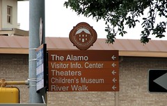
 Harry's map brought together a complicated system and created a colour coded, straightforward diagram that people could figure out at a glance. Our old system relied on the multiple location sign system that many cities still use. Instead of combining the two into one for our signage, as San Antonio has done below, it seems we've maybe taken the downside from both and combined them into an overcomplicated system for ourselves.
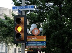
Now, it could be a case that I am too familiar with the system and therefore don't see the ease that the now 5 year old wayfinding system offers. I still see a lot of confused faces in The W, though.
Well, here's to Harry and good urban design !
Update: Since posting this I've been a lot more observant about the walkway system when using it. A few weeks on, here are some additional thoughts:
- I still think that using a "W" to mark the system is too simple. The letter is not going to become iconic enough that locals or visitors would pick up on what that means. The word skywalk or walkway should have been incorporated. Even the London underground system, it's logo recognized around the world, uses a word. It also uses the same colours, regardless of what part of the city you're in.
- I think that a rebranding is a failure when the body that commissioned it doesn't bother using it. If you notice in the recent announcement from thh city that the system will be expanded to the Convention Centre it does not refer to "the W" Walkway - it calls it the Skywalk - the name that Winnipeggers christened it long ago.
- From my read of the branding that means another colour will be rolled out for the logo for that stretch of the system.
2 comments:
Interesting post. I've seen that "W" map published before, and always thought it was pretty good.
Thanks. Last night to test out my comment "maybe I am just too familiar with it" I went from the Bay to the end of Portage Place and tried to concentrate the Post Office and tried to concentrate only on on the signs and maps posted.
It wasn't quite as bad as I though. the colour coding change, though was odd because, from the skywalk, you can't really tell why you are going from one colour pattern to the other. I'll maybe stop the net time I see someone looking confused and asked if the signs helped or not.
When the BIZ gets the map back up I will look at the larger version of it and take another look.
Post a Comment